Step 1 : Basic HTML Structure
HTML Code
<html>
<head>
<title>Basic Responsive Website</title>
<meta name="viewport" content="width=device-width,initial-scale=1.0,user-scalable=yes">
<link rel="stylesheet" type="text/css" href="css/style.css" />
</head>
<body>

<div id="wrapper">


</div>

</body>
</html>
CSS Code
*{
	margin-left:auto;
	margin-right:auto;
}
body{
	font-family:Arial, Helvetica, sans-serif;
	background:#FFF;
	margin:0px;
	}
.clearfix{ clear:both;}
#wrapper{
	width:1022px;
	margin:0px auto;
	background:#FFF;
	border:1px solid #CCC;
}
@media only screen and (min-width:320px) and (max-width:480px){ #wrapper{ width:375px;} }
@media only screen and (min-width:600px) and (max-width:768px){#wrapper{ width:768px;} }
Step 2 : Header (or) Menu
HTML Code
<div id="nav">
    <ul>
        <li><a href="#">Home</a></li>
        <li><a href="#">About Us</a></li>
        <li><a href="#">Servises</a></li>
        <li><a href="#">Gallery</a></li>
        <li><a href="#">Blog</a></li>
        <li><a href="#">Contact Us</a></li>
    </ul>
</div>
CSS Code
/*********** Start Header (or) Menu **********/
#nav{
	width:1022px;
	float:left;
	background:#CCC;
}
#nav ul{
	list-style:none;
	}
#nav ul li{
	list-style:none;
	font-family:arial;
	font-size:14px;
	text-transform:uppercase;
	padding:10px 0px 15px 0px;
	margin:5px 0px 12px;
	float:left;
	font-weight:bold;
}
#nav ul li a{
	padding:10px 45px 10px 45px;
	margin:5px 0px;
	text-decoration:none;
	color:#000;
	}
#nav ul li a:hover{
	color:#000;
	background:#FFF;
	}
/*********** End Header (or) Menu **********/

/************** Start Responsive Header (or) Menu  ******************/
/******** Start Mobile  Responsive ************/
@media only screen and (min-width:320px) and (max-width:480px){
	#nav{ width:375px; background:#F90; position:relative;}
	#nav ul{list-style:none; padding:0px; }
	#nav ul li{ width:100%; text-align:center; padding:1px 0px;}
	#nav ul li a{ color:#FFF; font-size:12px; padding:0px 0px !important;}
}
/******** End Mobile  Responsive ************/

/******** Start Tablets (or) Small screens  Responsive ************/
@media only screen and (min-width:600px) and (max-width:768px){
	#nav{ width:768px; background:#09C;}
	#nav ul{list-style:none; padding:0px; }
	#nav ul li{text-align:center; padding:5px 0px;}
	#nav ul li a{ padding:5px 30px 0px; color:#FFF;}
	}
/******** End Tablets (or) Small screens  Responsive ************/
/************** End Responsive Header (or) Menu  ******************/
Step 3 : Slider (or) Banner
HTML Code
<div class="banner">
     <img src="images/banner.jpg" alt="Banner Image" width="100%" />
</div>
CSS Code
/************* Start Slider (or) Banner *************/
.banner{
	width:1022px;
	height:auto;
}
/************** End Slider (or) Banner *************/

/************** Start Responsive Slider (or) Banner  ******************/
/******** Start Mobile  Responsive ************/
@media only screen and (min-width:320px) and (max-width:480px){
	.banner{ width:375px; margin:0px;}
}
/******** End Mobile  Responsive ************/

/******** Start Tablets (or) Small screens  Responsive ************/
@media only screen and (min-width:600px) and (max-width:768px){
	.banner{ width:768px; margin:0px;}
	}
/******** End Tablets (or) Small screens  Responsive ************/
/************** End Responsive Slider (or) Banner  ******************/
Step 4 : Content
HTML Code
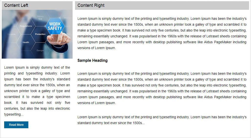
<div class="content">
<div class="content-left">
<div class="content-header">Content Left</div>
<div class="clearfix"></div>
<img src="images/content-left.jpg" />
<p>Lorem Ipsum is simply dummy text of the printing and typesetting industry. Lorem Ipsum has been the
industry's standard dummy text ever since the 1500s, when an unknown printer took a galley of type and
scrambled it to make a type specimen book. It has survived not only five centuries, but also the leap
into electronic typesetting...</p>
<a href="#" class="btn">Read More</a>
</div>
<div class="content-right">
<div class="content-header">Content Right</div>
<p>Lorem Ipsum is simply dummy text of the printing and typesetting industry. Lorem Ipsum has been the
industry's standard dummy text ever since the 1500s, when an unknown printer took a galley of type and
scrambled it to make a type specimen book...</p>
<h4> Sample Heading</h4>
<p>Lorem Ipsum is simply dummy text of the printing and typesetting industry. Lorem Ipsum has been the
industry's standard dummy text ever since the 1500s, when an unknown printer took a galley of type and
scrambled it to make a type specimen book....</p>
</div>
</div>
CSS Code
/*************** Start Content *****************/
.content{
	width:1020px;
	height:auto;
	border:1px solid #CCC;
	float:left;
	padding-bottom:20px;
}

.content-left{
	width:290px;
	height:auto;
	float:left;
	margin:5px;
}
p{
	font-size:14px;
	color:#000;
	line-height:24px;
	padding:10px;
	text-align:justify;
}
.content-right{
	width:710px;
	height:auto;
	float:left;
	margin:5px;
}
.content-header{
	background:#CCC;
	color:#000;
	font-size:18px;
	text-align:justify;
	padding:7px 10px 7px 10px;
	}

.btn{
	background:#069;
	color:#FFF;
	font-size:12px;
	padding:7px 20px;
	margin-left:10px;
	text-decoration:none;
	}
.btn:hover{
	background:#004F75;
	color:#FFF;
	}
/************ End Content **************/

/************** Start Responsive Content  ******************/
/******** Start Mobile  Responsive ************/
@media only screen and (min-width:320px) and (max-width:480px){
	.content{width:373px;}
	.content-left{ width:365px; margin:5px 4px 15px; clear:both;}
	.content-left img{ width:365px;}
	.content-header{background:#F90; color:#FFF;}
	.content-right{ width:365px; margin:5px auto; clear:both;}
	.btn{background:#F90;} .btn:hover{background:#F60;}
}
/******** End Mobile  Responsive ************/

/******** Start Tablets (or) Small screens  Responsive ************/
@media only screen and (min-width:600px) and (max-width:768px){
	.content{width:766px;}
	.content-left{ width:240px;}
	.content-left img{width:240px;}
	.content-header{background:#09C; color:#FFF;}
	.content-right{ width:504px;}
}
/******** End Tablets (or) Small screens  Responsive ************/
/************** End Responsive Content  ******************/
Step 5 : Footer
HTML Code
<div id="footer">
<ul>
<li><a href="#">Home</a></li>
<li><a href="#">About Us</a></li>
<li><a href="#">Servises</a></li>
<li><a href="#">Gallery</a></li>
<li><a href="#">Blog</a></li>
<li><a href="#">Contact Us</a></li>
</ul>
<div class="clearfix"></div>
<div id="copyrights">
© 2018. All rights reserved by <a href="http://www.freetimelearning.com" target="_blank">Free Time Learn</a>.
</div>
</div>
CSS Code
/************ Start Footer *****************/
#footer{
width:1022px;
float:left;
background:#CCC;
}
#footer ul{
	list-style:none;
	}
#footer ul li{
	list-style:none;
	font-family:arial;
	font-size:10px;
	text-transform:uppercase;
	padding:15px 0px 5px 0px;
	margin:5px 0px 12px;
	float:left;
	font-weight:bold;
}
#footer ul li a{
	padding:10px 55px 10px 55px;
	margin:5px 0px;
	text-decoration:none;
	color:#000;
	}
#footer ul li a:hover{
	color:#FFF;
	}

#copyrights{
	font-size:12px;
	color:#000;
	text-align:center;
	padding:5px 0px 10px 0px;
	}
#copyrights a{
color:#069;
text-decoration:none;
}
#copyrights a:hover{
	color:#666;
	}
/*************** End Footer ***********/

/************** Start Responsive Footer ******************/
/******** Start Mobile  Responsive ************/
@media only screen and (min-width:320px) and (max-width:480px){
	#footer{ width:375px; background:#F90;}
	#copyrights{color:#FFF;}
	#copyrights a{ color:#EEE;}
	#footer ul{ padding:0px 25px;}
	#footer ul li{ padding:15px 0px 5px; margin:5px 0px 12px;}
	#footer ul li a{padding:10px 6px; text-align:center; color:#FFF; font-size:9px;}
}
/******** End Mobile  Responsive ************/

/******** Start Tablets (or) Small screens  Responsive ************/
@media only screen and (min-width:600px) and (max-width:768px){
	#footer{ width:768px; background:#09C;}
	#copyrights{color:#FFF;}
	#copyrights a{ color:#EEE;}
	#footer ul{ padding:0px 60px;}
	#footer ul li{ padding:15px 0px 5px; margin:5px 0px 12px;}
	#footer ul li a{padding:10px 30px; text-align:center;}
}
/******** End Tablets (or) Small screens  Responsive ************/
/************** End Responsive Footer  ******************/