
<elementName propertyName="{markupExtension keyName}">

   <!-Content -->

</elementName>Window1.xaml file inside the Grid.<Grid.Resources>
<SolidColorBrush x:Key="lblbgcolor" Color="
Blue"/>
</Grid.Resources>
<Label Name="lbl" Margin="71,44,77,0" Background="{StaticResourcelblbgcolor}" Height="49" />
Window1.xaml file inside the Window element.<Window.Resources>
<SolidColorBrush x:Key="brush" Color="
Red" />
</Window.Resources>
<Button x:Name="btn" Content="Click Me" Click="Button_Click" Background="{DynamicResource brush}" Height="100" Width="100" />private void Button_Click(object sender, RoutedEventArgs e)
{
this.btn.SetResourceReference(BackgroundProperty, "brush");
}
<Window.Resources>) to define resource. SolidColorBrush resource named brush defined. Brush resource is used to set the background property of button.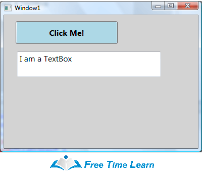
<Grid Name="StackPanel1" Background="LightGray" >
  <Button Name="Button1" Background="LightBlue" Height="45"
     Content="Click Me!" Margin="23,12,159,0" VerticalAlignment="Top"
     FontSize="16" FontWeight="Bold"
     VerticalContentAlignment="Bottom" HorizontalContentAlignment="Right" />
  <TextBox Height="50" Margin="26,72,74,0" Name="textBox1" VerticalAlignment="Top"
     Text="I am a TextBox" FontSize="16"
     VerticalContentAlignment="Bottom" HorizontalContentAlignment="Right" />
</Grid>
<elementName propertyName="{markupExtension keyName}">
   <!-Content -->
</elementName> | Silverlight | WPF |
|---|---|
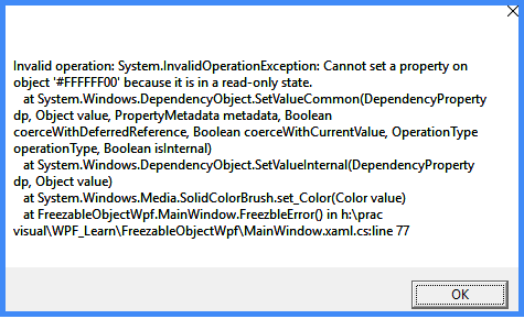
xmlns:x namespaces. As the default namespace, xmlns aids in resolving all WPF elements. XAML language definitions are resolved using the xmlns:x namespace. This is prefixed by the “x:” character. xmlns="http://schemas.microsoft.com/winfx/2006/xaml/presentation" xmlns:x="http://schemas.microsoft.com/winfx/2006/xaml" StackPanel" and "X:name". A "StackPanel" element is resolved using the default namespace and an "x:name" element using the "xmlns:x" namespace. <StackPanel x:Name="myStack" />SolidColorBrush myBrush = new SolidColorBrush(Colors.Blue;
myBrush.Freeze(); // Make the brush non-modifiable.
myBrush.Color = Colors.Green; // Attempting to modify frozen brushAs shown below, it throws an InvalidOperationException :
.BAML’ extension and embedded into .NET Framework assemblies as resources. BAML is a compressed declarative language that loads and parses faster than XAML. | No. | Page controls | Window controls |
|---|---|---|
| 1. | Page controls preside over the hosted browsers applications. | Window controls preside over windows application. |
| 2. | Page controls cannot contain window control. | Window controls may contain page control. |
| StaticResource | DynamicResource |
|---|---|
| StaticResources evaluate the resource one time only. | DynamicResource evaluates the resources every time they are required. |
| StaticResource is light. | DynamicResource is heavy due to frequently evaluated. |
| MVC | MVVM |
|---|---|
|
Stands for Model View Controller
|
Stands for Model View ViewModel
|
|
An Architectural pattern which is used for developing UI that divides an application into three interconnected parts such as Model, View, and Controller
|
A software Architectural pattern used for separation of Development of GUI and the development of Business Logic and back-end logic
|
|
The model represents Data, View represents UI, and Controller handles requests
|
The model represents objects, View represents UI layer, and ViewModel describes the binding between View and model
|
|
It was used by java springs and ASP.NET
|
It was used by WPF, Angular JS, and Silverlight
|
<page xmlns= '' ''>
  <TextBlock>
     Hello, World!
  </TextBlock>
</Page>TextBlockExtension.cs is as in the following :public static bool GetAllowOnlyString(DependencyObject obj)
{
return (bool) obj.GetValue(AllowOnlyStringProperty);
}
public static void SetAllowOnlyString(DependencyObject obj, bool value)
{
obj.SetValue(AllowOnlyStringProperty, value);
}
// Using a DependencyProperty as the backing store for AllowOnlyString. This enables animation, styling, binding, etc...
public static readonly DependencyProperty AllowOnlyStringProperty = DependencyProperty.RegisterAttached("AllowOnlyString", typeof (bool), typeof (TextblockExtension), new PropertyMetadata(false, AllowOnlyString));
private static void AllowOnlyString(DependencyObject d, DependencyPropertyChangedEventArgs e)
{
if (d is TextBox)
{
TextBox txtObj = (TextBox) d;
txtObj.TextChanged += (s, arg) =>
{
TextBox txt = s as TextBox;
if (!Regex.IsMatch(txt.Text, "^[a-zA-Z]*$"))
{
txtObj.BorderBrush = Brushes.Red;
MessageBox.Show("Only letter allowed!");
}
};
}
}MainWindow.xaml.cs I have defined my TextBox as in the following :<TextBox Width="200" Height="50" local:TextblockExtension.AllowOnlyString="True"></TextBox>| WPF | Winforms |
|---|---|
| It is the latest concept for building desktop/windows applications. | This is the old way to build desktop applications for Windows. |
| A markup language is used to design the UI, allowing complex user interfaces to be designed. | No markup language is used to design UI. Instead, event-driven controls are used. |
| Comparatively to WinForms, it provides effective and fully supported data binding. In data binding, a connection is established between the application UI (User Interface) and the data that the application displays. | Although it offers data binding, it does so in a limited way, so it's less effective than WPF. |
| Besides providing 2D and 3D vector capabilities, it also offers functionality such as rich, interactive, animated, hardware-accelerated functions. | In comparison to WPF, it does not provide rich, interactive, animated, hardware accelerated, vector 2D and 3D features. |
| It is not easy to use WPF as it requires good knowledge of the controls. | When developing applications, Windows forms are more convenient. |
| There is no limit to the customization of the UI, and the controls can be modified without difficulty since it is written from scratch. | It typically contains limited controls that are not easy to customize. |
| This is an efficient approach when building an application that requires a variety of media types, creates a skinned user interface, binds to XML, and creates a desktop application that has a web-like navigation style. | When you want to develop a simple application with few modern features and more resources online, it is considered good. |
X: Key uniquely identifies elements that are created and referenced in an XAML defined dictionary. By adding an x: Key value to an XAML object element a resource in the resource dictionary can be identified and is the most common way to identify. <TabControl>
<TabItem Header="Tab 1">xyz</TabItem>
<TabItem Header="Tab 2">abc</TabItem>
</TabControl><TabControl>
<TabItem Header="Tab 1">xyz</TabItem>
<TabItem Header="Tab 2">abc</TabItem>
</TabControl><Window.Clip>
<EllipseGeometry Center="150,160" RadiusX="120" RadiusY="120" />
</Window.Clip><Image Source="Garden.jpg">
<Image.Clip>
<EllipseGeometry Center="150,160" RadiusX="120" RadiusY="120" />
</Image.Clip>
</Image>private void ClipImage()
{
// Create a BitmapImage
BitmapImage bmpImage = new BitmapImage();
bmpImage.BeginInit();
bmpImage.UriSource = new Uri(@ "C:\Images\Garden.jpg", UriKind.RelativeOrAbsolute);
bmpImage.EndInit();
// Clipped Image
Image clippedImage = new Image();
clippedImage.Source = bmpImage;
EllipseGeometry clipGeometry = new EllipseGeometry(new Point(150, 160), 120, 120);
clippedImage.Clip = clipGeometry;
LayoutRoot.Children.Add(clippedImage);
}UpdateSourceTrigger<grid>
<Grid.ColumnDefinitions>
<ColumnDefinition Width="50*" />
<ColumnDefinition Width="50*" />
</Grid.ColumnDefinitions>
<TextBlock Text="Source:" Width="auto" />
<TextBox Name="SourceText" Width="160" Height="30" Margin="48,0,44,82" />
<TextBlock Text="Target:" Grid.Column="1" Width="auto" />
<TextBox Name="TargetText" Width="160" Height="30" Text="{Binding ElementName=SourceText, Path=Text,UpdateSourceTrigger=Default}" Grid.Column="1" Margin="44,0,47,82" />
</grid>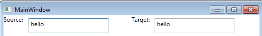
<AccessText>_Click Me</AccessText><Button Name="Button1" Width="120" Height="50" Margin="33,70,59,124" FontSize="16" Click="Button1_Click">
<AccessText>_Click Me</AccessText>
</Button>VirtualizingStackPanel control in WPF is used to implement virtualization.The IsVirtualizing property of the VirtualizingStackPanel activates the virtualization. By default, the IsVirtualizing property is set to true. When IsVirtualizing is set to false, a VirtualizingStackPanel behaves the same as an ordinary StackPanel. <VirtualizingStackPanel Width="300" Height="200" />VirtualizingStackPanel.VirtualizationMode property has two values, Standard and Recycling. The default value of VirtualizationMode is Standard and means that the VirtualizingStackPanel creates an item container for each visible item and discards it when it is no longer needed (such as when the item is scrolled out of view). When an ItemsControl contains many items, the process of creating and discarding item containers can degrade performance. In that case, using the Recycling reuses item containers instead of creating a new one each time.