
Popper.js is an Opensource javascript framework for showing/hiding/reusing beautiful popovers and tooltips on web applications. In this tutorial you'll learn how to use Popper by building a basic tooltip. Remember, Popper is not a tooltip library, it's the foundation to build one! <body> is the popper element's offsetParent, and it's taller than the viewport.<!DOCTYPE html>
<html>
<!-- ... -->
</html># With npm
npm i @popperjs/core
# With Yarn
yarn add @popperjs/core<!-- Development version -->
<script src="https://unpkg.com/@popperjs/core@2/dist/umd/popper.js"></script>
<!-- Production version -->
<script src="https://unpkg.com/@popperjs/core@2"></script>unpkg CDN, which includes all of its features. You can call the Popper.createPopper constructor to create new popper instances.<!DOCTYPE html>
<title>Popper example</title>
<style>
#tooltip {
background-color: #333;
color: white;
padding: 5px 10px;
border-radius: 4px;
font-size: 13px;
}
</style>
<button id="button" aria-describedby="tooltip">I'm a button</button>
<div id="tooltip" role="tooltip">I'm a tooltip</div>
<script src="https://unpkg.com/@popperjs/core@2"></script>
<script>
const button = document.querySelector('#button');
const tooltip = document.querySelector('#tooltip');
// Pass the button, the tooltip, and some options, and Popper will do the
// magic positioning for you:
Popper.createPopper(button, tooltip, {
placement: 'right',
});
</script>createPopper constructor from the fully-featured file :import { createPopper } from '@popperjs/core';
const button = document.querySelector('#button');
const tooltip = document.querySelector('#tooltip');
// Pass the button, the tooltip, and some options, and Popper will do the
// magic positioning for you:
createPopper(button, tooltip, {
placement: 'right',
}); 5 kB minzipped, but it may grow a bit in the future.esm (works with import syntax — recommended)umd (works with <script> tags or RequireJS)cjs (works with require() syntax)/lib, and one for browsers with native support for ES Modules, under /dist/esm. The only difference within the two, is that the browser-compatible version doesn't make use of process.env.NODE_ENV to run development checks.popper : includes all the modifiers (features) in one file (default);popper-lite : includes only the minimum amount of modifiers to provide the basic functionality;popper-base : doesn't include any modifier, you must import them separately;npx create-react-app foldernamecd foldernamenpm install @material-ui/coreExample : Now write down the following code in the App.js file. Here, App is our default component where we have written our code.
import React from 'react';
import Popper from '@material-ui/core/Popper';

export default function App() {
  const [anchorEl, setAnchorEl] = React.useState(null);
  const open = Boolean(anchorEl);
    return (
         <div style={{ display: 'block', padding: 30 }}>
         <h4>How to use Popper Component in ReactJS?</h4>
      <button type="button" onClick={(event) => {
        setAnchorEl(anchorEl ? null : event.currentTarget);
      }}>
        Click Me to Toggle Popper
      </button>
      <Popper
        id={open ? 'simple-popper' : undefined}
        open={open}
        anchorEl={anchorEl}>
        <div style={{
          padding: 2,
          border: '1px solid',
          backgroundColor: 'gray',
        }}>Greetings from Free Time Learn</div>
      </Popper>
    </div>
  );
}
Step to Run Application : Run the application using the following command from the root directory of the project.
npm startOutput : Now open your browser and go to http://localhost:3000/, you will see the following output.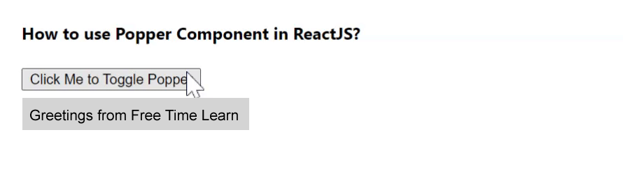
data-popper-arrow attribute like so:<div id="tooltip" role="tooltip">
My tooltip
<div id="arrow" data-popper-arrow></div>
</div>#arrow,
#arrow::before {
position: absolute;
width: 8px;
height: 8px;
background: inherit;
}
#arrow {
visibility: hidden;
}
#arrow::before {
visibility: visible;
content: '';
transform: rotate(45deg);
}::before pseudo-element is required because Popper uses transform to position the arrow inside the popper, but we want to use our own transform to rotate the arrow box into a diamond.data-popper-placement attribute :#tooltip[data-popper-placement^='top'] > #arrow {
bottom: -4px;
}
#tooltip[data-popper-placement^='bottom'] > #arrow {
top: -4px;
}
#tooltip[data-popper-placement^='left'] > #arrow {
right: -4px;
}
#tooltip[data-popper-placement^='right'] > #arrow {
left: -4px;
} ^=? This means "starts with", because we can also have variation placements like top-start.
const popperInstance = Popper.createPopper(button, tooltip, {
  modifiers: [
    {
      name: 'offset',
      options: {
        offset: [0, 8],
      },
    },
  ],
});
Output : 
Imports
// esm
import { createPopper } from '@popperjs/core';

// cjs
const { createPopper } = require('@popperjs/core');

// umd
const { createPopper } = Popper;
Usage :
const reference = document.querySelector('#reference');
const popper = document.querySelector('#popper');

createPopper(reference, popper, {

  // options

});
Options :
type Options = {|
  placement: Placement, // "bottom"
  modifiers: Array<$Shape<Modifier<any>>>, // []
  strategy: PositioningStrategy, // "absolute",
  onFirstUpdate?: ($Shape<State>) => void, // undefined
|};

type Placement =
  | 'auto'
  | 'auto-start'
  | 'auto-end'
  | 'top'
  | 'top-start'
  | 'top-end'
  | 'bottom'
  | 'bottom-start'
  | 'bottom-end'
  | 'right'
  | 'right-start'
  | 'right-end'
  | 'left'
  | 'left-start'
  | 'left-end';
type Strategy = 'absolute' | 'fixed';
placement : Describes the preferred placement of the popper. Modifiers like flip may change the placement of the popper to make it fit better.
createPopper(reference, popper, {

  placement: 'right-start',

});
The "auto" placements will choose the side with most space.
modifiers : Describes the array of modifiers to add or configure. The default (full) version of Popper includes all modifiers listed in the menu.
createPopper(reference, popper, {
  modifiers: [
    {
      name: 'flip',
      enabled: false,
    },
  ],
});
strategy : Describes the positioning strategy to use. By default, it is absolute, which in the simplest cases does not require repositioning of the popper.
If your reference element is in a fixed container, use the fixed strategy:
createPopper(reference, popper, {

  strategy: 'fixed',

});// esm
import { popperGenerator } from '@popperjs/core';
// cjs
const { popperGenerator } = require('@popperjs/core');
// umd
const { popperGenerator } = Popper;const createPopper = popperGenerator({
defaultOptions: { placement: 'top' },
defaultModifiers: [popperOffsets, computeStyles, applyStyles, eventListeners],
});
// Now your custom `createPopper` is ready to use.type PopperGenerator = (options?: PopperGeneratorOptions) => CreatePopper;
type PopperGeneratorOptions = {
defaultModifiers?: Array<Modifier<any>>,
defaultOptions?: $Shape<Options>,
};createPopper.instance.update().State, from where you will optionally be able to read the updated positions.const state = await popperInstance.update();update() method.const state = await popperInstance.setOptions({ placement: 'bottom' });onFirstUpdate property in the Popper options:createPopper(referenceElement, popperElement, {
onFirstUpdate: state => console.log('Popper positioned on', state.placement),
});afterWrite as your custom modifier's phase.createPopper(reference, popper, {
modifiers: [
{
name: 'flip',
options: {
fallbackPlacements: ['top', 'bottom'],
},
},
],
});* beforeRead
* read
* afterRead
* beforeMain
* main
* afterMain
* beforeWrite
* write
* afterWritestate.reset to true.offset relies on popperOffsets data, since it mutates its properties.preventOverflow relies on offset, but only if offset actually exists, because offset mutates the popperOffsets data, which preventOverflow needs to read and mutate. If offset doesn't exist, preventOverflow will still work as normal.function effect() {
// perform side effects
return () => {
// cleanup side effects
};
}eventListeners modifier uses this to add and remove window/document event listeners which is not part of the main modifier update cycle.state.elements. The arrow modifier is dependent on preventOverflow (run after), but preventOverflow depends on state.elements.arrow. Since effects are run before the first update cycle, the problem is resolved.state.modifiersData.<MODIFIER_NAME>, which is shared to other modifiers to be read or manipulated.const topLogger = {
name: 'topLogger',
enabled: true,
phase: 'main',
fn({ state }) {
if (state.placement === 'top') {
console.log('Popper is on the top');
}
},
};
createPopper(reference, popper, {
modifiers: [topLogger],
});type Modifier = {|
// Required properties
name: string,
enabled: boolean,
phase: ModifierPhases,
fn: (ModifierArguments<Options>) => ?State,
// Optional properties
requires?: Array<string>,
requiresIfExists?: Array<string>,
effect?: (ModifierArguments<Options>) => ?() => void,
options?: {},
data?: {},
|};
type ModifierArguments<Options: Obj> = {
state: $Shape<State>,
instance: Instance,
options: $Shape<Options>,
name: string,
};popperOffsets modifier is at the core of Popper, it computes the offsets needed to position the popper element near the reference element.read
type Data = {
  x: number,
  y: number,
};detectOverflow utility returns an object of overflow offsets of the popper or reference element relative to a given boundary.import { detectOverflow } from '@popperjs/core';
const overflow = detectOverflow(state, options);type Options = {
placement: Placement, // state.placement
elementContext: Context, // "popper"
boundary: Boundary, // "clippingParents"
rootBoundary: RootBoundary, // "viewport"
altBoundary: boolean, // false
padding: Padding, // 0
};
// Below are the relative types
type Context = 'reference' | 'popper';
type Boundary = 'clippingParents' | HTMLElement | Array<HTMLElement>;
type RootBoundary = 'document' | 'viewport';
type Padding =
| number
| {|
top?: number,
right?: number,
bottom?: number,
left?: number,
|};state.placement.detectOverflow(state, {
elementContext: 'reference', // 'popper' by default
});clippingParents", which are the scrolling containers that may cause the element to be partially or fully cut off.const customBoundary = document.querySelector('#boundary');
detectOverflow(state, {
boundary: customBoundary, // 'clippingParents' by default
});viewport" is default, which is the area of the document the user can actually see on the screen. "document" is the entire page which can be potentially scrolled.detectOverflow(state, {
rootBoundary: 'document', // 'viewport' by default
});elementContext is "popper", then it will check the reference's boundary context, and vice-versa.detectOverflow(state, {
altBoundary: true, // false by default
});number, which will be equal padding on all four sides, or an object containing side properties each with their own padding value.detectOverflow(state, {
// Same padding on all four sides
padding: 8,
// Different padding on certain sides – unspecified sides are 0
padding: { top: 8, right: 16 },
});// If the number is positive, the popper is overflowing by that number of pixels.
// When 0, or negative, the popper is within its boundaries.
type OverflowOffsets = {
top: number,
bottom: number,
right: number,
left: number,
};requiresIfExists, as the util needs to have access to this information if offset exists in the modifier lifecycle:import { detectOverflow } from '@popperjs/core';
const myModifier = {
name: 'myModifier',
enabled: true,
phase: 'main',
requiresIfExists: ['offset'],
fn({ state }) {
const overflow = detectOverflow(state);
// ...
},
};detectOverflow only considers the offset modifier by default and reports values as though no other modifier is currently affecting it. This means if preventOverflow is enabled, its values should be taken into account (state.modifiersData.preventOverflow), along with any other potential modifier that alters popperOffsets.type VirtualElement = {|
getBoundingClientRect: () => ClientRect | DOMRect,
contextElement?: Element,
|};contextElement is an optional property that describes the DOM context of the virtual element. This is necessary if getBoundingClientRect is derived from a real DOM element, and that element is within a different scrolling container context to the popper element.function generateGetBoundingClientRect(x = 0, y = 0) {
return () => ({
width: 0,
height: 0,
top: y,
right: x,
bottom: y,
left: x,
});
}
const virtualElement = {
getBoundingClientRect: generateGetBoundingClientRect(),
};
const instance = createPopper(virtualElement, popper);
document.addEventListener('mousemove', ({ clientX: x, clientY: y }) => {
virtualElement.getBoundingClientRect = generateGetBoundingClientRect(x, y);
instance.update();
});<body />, this is of course supported as well, but some measures should be taken to ensure that everything works in the best possible way.<body /> element, but instead create a <div /> element right within the <body /> and use it as container of your poppers.import {
popperGenerator,
defaultModifiers,
} from '@popperjs/core/lib/popper-lite';
import flip from '@popperjs/core/lib/modifiers/flip';
import preventOverflow from '@popperjs/core/lib/modifiers/preventOverflow';
const createPopper = popperGenerator({
defaultModifiers: [...defaultModifiers, flip, preventOverflow],
});
// Now you can use `createPopper`// ❌ Imports all of Popper!
import { createPopper } from '@popperjs/core';// ✅
import { createPopper } from '@popperjs/core/lib/popper-lite';* popperOffsets
* computeStyles
* applyStyles
* eventListeners@popperjs/core/lib/modifiers/ directory.flip and preventOverflow since these are the most attractive reasons for using Popper in the first place:import { createPopper } from '@popperjs/core/lib/popper-lite';
import flip from '@popperjs/core/lib/modifiers/flip';
import preventOverflow from '@popperjs/core/lib/modifiers/preventOverflow';
createPopper(reference, popper, {
modifiers: [flip, preventOverflow],
});