Anime.js is a small, lightweight JavaScript library with a simple and small powerful API. It works with the DOM element, CSS, and JavaScript object.Anime.js is a lightweight JavaScript library with a simple and small powerful API. It works with the DOM element, CSS, and JavaScript object.anime.min.js file and directly use it.$ npm install animejs --saveimport anime from 'animejs/lib/anime.es.js';const anime = require('animejs');anime.min.js in your HTML :<script src="anime.min.js"></script>google anime.js CDN and you will get the link and just put it in your script tag as shown below.<script src=”https://cdnjs.cloudflare.com/ajax/libs/animejs/3.2.1/anime.min.js”></script>​anime({
targets: 'div',
translateX: 250,
rotate: '1turn',
backgroundColor: '#FFF',
duration: 800
});​mkdir animation && cd animation
touch index.html <!DOCTYPE html>
<html>
<head>
<title>A nice example for timeline</title>
<script src=
"https://cdnjs.cloudflare.com/ajax/libs/animejs/3.2.0/anime.min.js">
</script>
<style>
html{
min-height: 200vh;
}
.ball {
width: 60px;
height: 60px;
margin-top: 120px;
margin-left:200px;
border-radius: 50%;
background-color: pink;
float: left;
}
</style>
</head>
<body>
<body>
<div class="ball first"></div>
<div class="ball second"></div>
<div class="ball third"></div>
<script>
let animation = anime.timeline({
duration: 500,
easing: 'easeInOutSine',
direction: 'alternate',
autoplay:false,
loop: true
});
animation.add({
targets: '.first',
translateY: -50,
backgroundColor: 'rgb(255, 0, 0)'
}).add({
targets: '.second',
translateY: -50,
backgroundColor: 'rgb(0, 255, 0)'
}).add({
targets: '.third',
translateY: -50,
backgroundColor: 'rgb(0, 0, 255)'
});
window.onscroll=()=>{
animation.play();
}
</script>
</body>
</html>
index.html to open it in browser :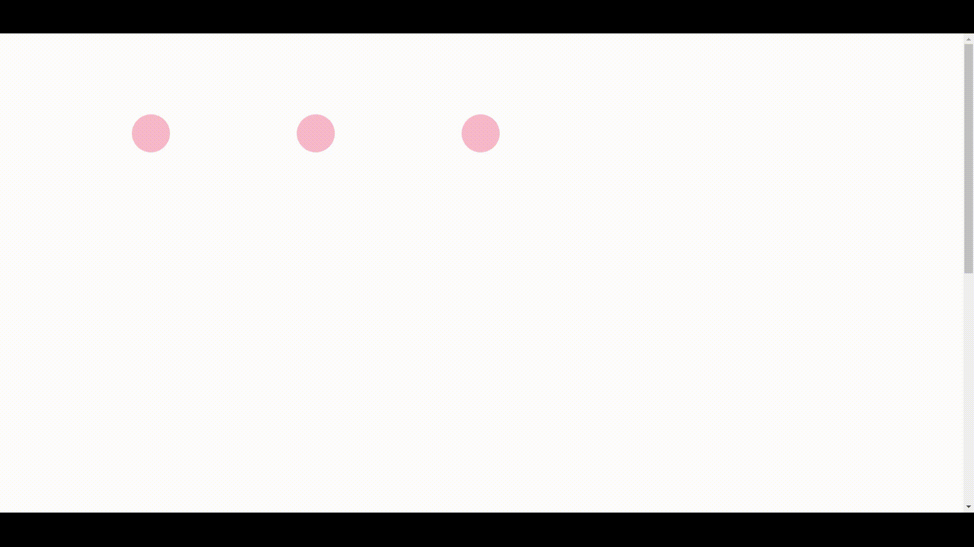
Anime.js, we must use the callanime() function by passing it with key-value pairs to specify target elements. Once the target element is specified, the attributes can be easily animated using the key. This key tells Anime.js which element needs to be animated. It can accept different formats. Some of the target elements are at this moment discussed below.var blue = anime({
targets: '.blue',
translateY: 200
});
var redBlue = anime({
targets: '.red, .blue',
translateY: 200
});
var even = anime({
targets: '.square:nth-child(even)',
translateY: 200
});
var notRed = anime({
targets: '.square:not(.red)',
translateY: 200
});​NodeListastargetsThe key. The following code snippets depict its application.var special = anime({
targets: document.getElementById('special'),
translateY: 200
});
var blue = anime({
targets: document.querySelector('.blue'),
translateY: 200
});
var redBlue = anime({
targets: document.querySelectorAll('.red, .blue'),
translateY: 200
});
var even = anime({
targets: document.querySelectorAll('.square:nth-child(even)'),
translateY: 200
});
var notRed = anime({
targets: document.querySelectorAll('.square:not(.red)'),
translateY: 200
}); ​usedgetElementById() function which fetches special elements and querySelector() function to get each blue class element. To match the selector group, we use querySelectorAll() to get all the elements present in the document selector group.usegetElementByClasasName() to fetch elements of a specific class and can access usegetElementsByTagName() to fetch tag names. Almost any such function can be used to return the DOM node or NodeList along with the key value.var filesScanned = { count: 0, infected: 0 };
var scanning = anime({
targets: filesScanned,
count: 1000,
infected: 8,
round: 1,
update: function() {
var scanCount = document.querySelector('.scan-count');
scanCount.innerHTML = filesScanned.count;
var infectedCount = document.querySelector('.infected-count');
infectedCount.innerHTML = filesScanned.infected;
}
}); ​0 to 1000 and infected files ranging from 0 to 8. Remember, we can only animate them using these absolute values provided in the range. If we try to animate a key from "AAA" to "BOY", it will roll out an error.var multipleAnimations = anime({
targets: [document.querySelectorAll('.blue'), '.red, #special'],
translateY: 250
}); var animateLeft = anime({
targets: '.square',
left: '50%'
});
var animateBackground = anime({
targets: '.square',
backgroundColor: '#f96'
}); ​var animateScaling = anime({
targets: '.square',
scale: 0.8
});
var animateTranslation = anime({
targets: '.square',
translateX: window.innerWidth*0.8
});
var animateRotation = anime({
targets: '.square',
rotate: '1turn'
});
var animateAll = anime({
targets: '.square',
scale: 0.8,
translateX: window.innerWidth*0.8,
rotate: '1turn'
}); ​var animateX = anime({
targets: '.circle',
cx: window.innerWidth*0.6
});
var animateStrokeWidth = anime({
targets: '.circle',
strokeWidth: '25'
});​var animateProgress = anime({
targets: 'progress',
value: 100,
easing: 'linear'
}); ​| Valid properties | Default unit |
|---|---|
'translateX' |
'px' |
'translateY' |
'px' |
'translateZ' |
'px' |
'rotate' |
'deg' |
'rotateX' |
'deg' |
'rotateY' |
'deg' |
'rotateZ' |
'deg' |
'scale' |
— |
'scaleX' |
— |
'scaleY' |
— |
'scaleZ' |
— |
'skew' |
'deg' |
'skewX' |
'deg' |
'skewY' |
'deg' |
'perspective' |
'px' |
Example :
anime({
  targets: '.css-transforms-demo .el',
  translateX: 250,
  scale: 2,
  rotate: '1turn'
});​| Example | value |
|---|---|
prop1 |
50 |
'prop2' |
'100%' |
var objPropLogEl = document.querySelector('.js-object-log');

var myObject = {
  prop1: 0,
  prop2: '0%'
}

anime({
  targets: myObject,
  prop1: 50,
  prop2: '100%',
  easing: 'linear',
  round: 1,
  update: function() {
    objPropLogEl.innerHTML = JSON.stringify(myObject);
  }
});| Type | Default | Example |
|---|---|---|
| Number | 1000 |
3000 |
| anime.stagger | See staggering section | anime.stagger(150) |
| Function | See function based parameters section | (el, i) => i * 150 |
anime({
  targets: '.duration-demo .el',
  translateX: 250,
  duration: 3000
});| Type | Default | Example |
|---|---|---|
| Number | 0 |
1000 |
| anime.stagger | See staggering section | anime.stagger(150) |
| Function | See function based parameters section | (el, i) => i * 150 |
anime({
  targets: '.delay-demo .el',
  translateX: 250,
  delay: 1000
});| Type | Default | Example |
|---|---|---|
| Number | 0 |
1000 |
| anime.stagger | See staggering section | anime.stagger(150) |
| Function | See function based parameters section | (el, i) => i * 150 |
anime({
  targets: '.end-delay-demo .el',
  translateX: 250,
  endDelay: 1000,
  direction: 'alternate'
});| Type | Default | Example |
|---|---|---|
| String | 'easeOutElastic(1, .5)' |
easing: 'easeInOutQuad' |
anime({
  targets: '.easing-demo .el',
  translateX: 250,
  easing: 'easeInOutExpo'
});| Type | Default | Example |
|---|---|---|
| Number | 0 |
round: 10 |
var roundLogEl = document.querySelector('.round-log');

anime({
  targets: roundLogEl,
  innerHTML: [0, 10000],
  easing: 'linear',
  round: 10 // Will round the animated value to 1 decimal
});| Type | Example |
|---|---|
| Object | rotate: {
value: 360,
duration: 1800,
easing: 'easeInOutSine'
} |
anime({
targets: '.specific-prop-params-demo .el',
translateX: {
value: 250,
duration: 800
},
rotate: {
  value: 360,
  duration: 1800,
  easing: 'easeInOutSine'
},
scale: {
value: 2,
duration: 1600,
delay: 800,
easing: 'easeInOutQuart'
},
delay: 250 // All properties except 'scale' inherit 250ms delay
});| Arguments | Infos |
|---|---|
target |
The curent animated targeted element |
index |
The index of the animated targeted element |
targetsLength |
The total number of animated targets |
anime({
  targets: '.function-based-params-demo .el',
  translateX: 270,
  direction: 'alternate',
  loop: true,
  delay: function(el, i, l) {
    return i * 100;
  },
  endDelay: function(el, i, l) {
    return (l - i) * 100;
  }
});| Accepts | Infos |
|---|---|
'normal' |
Animation progress goes from 0 to 100% |
'reverse' |
Animation progress goes from 100% to 0% |
'alternate' |
Animation progress goes from 0% to 100% then goes back to 0% |
anime({
  targets: '.dir-normal',
  translateX: 250,
  easing: 'easeInOutSine'
});

anime({
  targets: '.dir-reverse',
  translateX: 250,
  direction: 'reverse',
  easing: 'easeInOutSine'
});

anime({
  targets: '.dir-alternate',
  translateX: 250,
  direction: 'alternate',
  easing: 'easeInOutSine'
});
Loop : Defines the number of iterations of your animation.
| Accepts | Infos |
|---|---|
Number |
The number of iterations |
true |
Loop indefinitely |
Example :
anime({
  targets: '.loop',
  translateX: 270,
  loop: 3,
  easing: 'easeInOutSine'
});

anime({
  targets: '.loop-infinity',
  translateX: 270,
  loop: true,
  easing: 'easeInOutSine'
});

anime({
  targets: '.loop-reverse',
  translateX: 270,
  loop: 3,
  direction: 'reverse',
  easing: 'easeInOutSine'
});

anime({
  targets: '.loop-reverse-infinity',
  translateX: 270,
  direction: 'reverse',
  loop: true,
  easing: 'easeInOutSine'
});

anime({
  targets: '.loop-alternate',
  translateX: 270,
  loop: 3,
  direction: 'alternate',
  easing: 'easeInOutSine'
});

anime({
  targets: '.loop-alternate-infinity',
  translateX: 270,
  direction: 'alternate',
  loop: true,
  easing: 'easeInOutSine'
});
Autoplay : Defines if the animation should automatically starts or not.
| Accepts | Infos |
|---|---|
true |
Automatically starts the animation |
false |
Animation is paused by default |
anime({
  targets: '.autoplay-true',
  translateX: 250,
  autoplay: true,
  easing: 'easeInOutSine'
});

anime({
  targets: '.autoplay-false',
  translateX: 250,
  autoplay: false,
  easing: 'easeInOutSine'
});| Type | Example |
|---|---|
| Number | translateX: 250 |
anime({
  targets: '.unitless-values-demo .el',
  translateX: 250, // -> '250px'
  rotate: 540 // -> '540deg'
});
Specific Unit : Forces the animation to use a certain unit and will automatically convert the initial target value.
| Type | Example |
|---|---|
| String | width: '100%' |
anime({
  targets: '.specific-unit-values-demo .el',
  width: '100%', // -> from '28px' to '100%',
  easing: 'easeInOutQuad',
  direction: 'alternate',
  loop: true
});
Relative : Adds, substracts or multiplies the original value.
| Accepts | Effect | Example |
|---|---|---|
'+=' |
Add | '+=100' |
'-=' |
Substract | '-=2turn' |
'*=' |
Multiply | '*=10' |
var relativeEl = document.querySelector('.el.relative-values');
relativeEl.style.transform = 'translateX(100px)';

anime({
  targets: '.el.relative-values',
  translateX: {
    value: '*=2.5', // 100px * 2.5 = '250px'
    duration: 1000
  },
  width: {
    value: '-=20px', // 28 - 20 = '8px'
    duration: 1800,
    easing: 'easeInOutSine'
  },
  rotate: {
    value: '+=2turn', // 0 + 2 = '2turn'
    duration: 1800,
    easing: 'easeInOutSine'
  },
  direction: 'alternate'
});
Color : anime.js accepts and converts Hexadecimal, RGB, RGBA, HSL, and HSLA color values.
* CSS color codes ( e.g. : 'red', 'yellow', 'aqua' ) are not supported.
| Accepts | Example |
|---|---|
| Hexadecimal | '#FFF' or '#FFFFFF' |
| RGB | 'rgb(255, 255, 255)' |
| RGBA | 'rgba(255, 255, 255, .2)' |
| HSL | 'hsl(0, 100%, 100%)' |
| HSLA | 'hsla(0, 100%, 100%, .2)' |
var colorsExamples = anime.timeline({
  endDelay: 1000,
  easing: 'easeInOutQuad',
  direction: 'alternate',
  loop: true
})
.add({ targets: '.color-hex',  background: '#FFF' }, 0)
.add({ targets: '.color-rgb',  background: 'rgb(255,255,255)' }, 0)
.add({ targets: '.color-hsl',  background: 'hsl(0, 100%, 100%)' }, 0)
.add({ targets: '.color-rgba', background: 'rgba(255,255,255, .2)' }, 0)
.add({ targets: '.color-hsla', background: 'hsla(0, 100%, 100%, .2)' }, 0)
.add({ targets: '.colors-demo .el', translateX: 270 }, 0);
From To : Forces the animation to start at a specified value.
| Type | Example |
|---|---|
Array |
['50%', '100%'] |
anime({
  targets: '.el.from-to-values',
  translateX: [100, 250], // from 100 to 250
  delay: 500,
  direction: 'alternate',
  loop: true
});
Function Based Values :
Get different values for every target and property of the animation.
The function accepts 3 arguments :
| Arguments | Infos |
|---|---|
target |
The curently animated targeted element |
index |
The index of the animated targeted element |
targetsLength |
The total number of animated targets |
anime({
  targets: '.function-based-values-demo .el',
  translateX: function(el) {
    return el.getAttribute('data-x');
  },
  translateY: function(el, i) {
    return 50 + (-50 * i);
  },
  scale: function(el, i, l) {
    return (l - i) + .25;
  },
  rotate: function() { return anime.random(-360, 360); },
  borderRadius: function() { return ['50%', anime.random(10, 35) + '%']; },
  duration: function() { return anime.random(1200, 1800); },
  delay: function() { return anime.random(0, 400); },
  direction: 'alternate',
  loop: true
});| Type | Example |
|---|---|
Array |
[
  {value: 100, easing: 'easeOutExpo'},
  {value: 200, delay: 500},
  {value: 300, duration: 1000}
] |
anime({
  targets: '.animation-keyframes-demo .el',
  keyframes: [
    {translateY: -40},
    {translateX: 250},
    {translateY: 40},
    {translateX: 0},
    {translateY: 0}
  ],
  duration: 4000,
  easing: 'easeOutElastic(1, .8)',
  loop: true
});​
Property Keyframes : Similar to animation keyframes, property keyframes are defined using an Array of property Object. Property keyframes allow overlapping animations since each property have its own keyframes array.
| Type | Example |
|---|---|
Array |
[
  {value: 100, easing: 'easeOutExpo'},
  {value: 200, delay: 500},
  {value: 300, duration: 1000}
] |
anime({
  targets: '.property-keyframes-demo .el',
  translateX: [
    { value: 250, duration: 1000, delay: 500 },
    { value: 0, duration: 1000, delay: 500 }
  ],
  translateY: [
    { value: -40, duration: 500 },
    { value: 40, duration: 500, delay: 1000 },
    { value: 0, duration: 500, delay: 1000 }
  ],
  scaleX: [
    { value: 4, duration: 100, delay: 500, easing: 'easeOutExpo' },
    { value: 1, duration: 900 },
    { value: 4, duration: 100, delay: 500, easing: 'easeOutExpo' },
    { value: 1, duration: 900 }
  ],
  scaleY: [
    { value: [1.75, 1], duration: 500 },
    { value: 2, duration: 50, delay: 1000, easing: 'easeOutExpo' },
    { value: 1, duration: 450 },
    { value: 1.75, duration: 50, delay: 1000, easing: 'easeOutExpo' },
    { value: 1, duration: 450 }
  ],
  easing: 'easeOutElastic(1, .8)',
  loop: true
});​var myTimeline = anime.timeline(parameters);| Argument | Type | Info | Required |
|---|---|---|---|
parameters |
Object |
The default parameters of the timeline inherited by children | No |
myTimeline.add(parameters, offset);
| Argument | Types | Info | Required |
|---|---|---|---|
parameters |
Object |
The child animation parameters, override the timeline default parameters | Yes |
time offset |
String or Number |
Check out the Timeline offsets section | No |
// Create a timeline with default parameters
var tl = anime.timeline({
  easing: 'easeOutExpo',
  duration: 750
});

// Add children
tl
.add({
  targets: '.basic-timeline-demo .el.square',
  translateX: 250,
})
.add({
  targets: '.basic-timeline-demo .el.circle',
  translateX: 250,
})
.add({
  targets: '.basic-timeline-demo .el.triangle',
  translateX: 250,
});​.add() function. It defines when a animation starts in the timeline, if no offset is specifed, the animation will starts after the previous animation ends.| Type | Offset | Example | Infos |
|---|---|---|---|
| String | '+=' |
'+=200' |
Starts 200ms after the previous animation ends |
| String | '-=' |
'-=200' |
Starts 200ms before the previous animation ends |
| Number | Number |
100 |
Starts at 100ms, reagardless of the animtion position in the timeline |
// Create a timeline with default parameters
var tl = anime.timeline({
  easing: 'easeOutExpo',
  duration: 750
});

tl
.add({
  targets: '.offsets-demo .el.square',
  translateX: 250,
})
.add({
  targets: '.offsets-demo .el.circle',
  translateX: 250,
}, '-=600') // relative offset
.add({
  targets: '.offsets-demo .el.triangle',
  translateX: 250,
}, 400); // absolute offset​var tl = anime.timeline({
targets: '.params-inheritance-demo .el',
delay: function(el, i) { return i * 200 },
duration: 500, // Can be inherited
easing: 'easeOutExpo', // Can be inherited
direction: 'alternate', // Is not inherited
loop: true // Is not inherited
});
tl
.add({
translateX: 250,
// override the easing parameter
easing: 'spring',
})
.add({
opacity: .5,
scale: 2
})
.add({
// override the targets parameter
targets: '.params-inheritance-demo .el.triangle',
rotate: 180
})
.add({
translateX: 0,
scale: 1
});animation.play();animation.pause();
var animation = anime({
  targets: '.play-pause-demo .el',
  translateX: 270,
  delay: function(el, i) { return i * 100; },
  direction: 'alternate',
  loop: true,
  autoplay: false,
  easing: 'easeInOutSine'
});

document.querySelector('.play-pause-demo .play').onclick = animation.play;
document.querySelector('.play-pause-demo .pause').onclick = animation.pause;​animation.restart();
var animation = anime({
  targets: '.restart-demo .el',
  translateX: 250,
  delay: function(el, i) { return i * 100; },
  direction: 'alternate',
  loop: true,
  easing: 'easeInOutSine'
});

document.querySelector('.restart-demo .restart').onclick = animation.restart;animation.reverse();var animation = anime({
targets: '.reverse-anim-demo .el',
translateX: 270,
loop: true,
delay: function(el, i) { return i * 200; },
easing: 'easeInOutSine'
});
document.querySelector('.reverse-anim-demo .reverse').onclick = animation.reverse;animation.seek(timeStamp);animation.seek((scrollPercent / 100) * animation.duration);var animation = anime({
targets: '.seek-anim-demo .el',
translateX: 270,
delay: function(el, i) { return i * 100; },
elasticity: 200,
easing: 'easeInOutSine',
autoplay: false
});
var seekProgressEl = document.querySelector('.seek-anim-demo .progress');
seekProgressEl.oninput = function() {
animation.seek(animation.duration * (seekProgressEl.value / 100));
};anime.js instance.timeline.play();
timeline.pause();
timeline.restart();
timeline.seek(timeStamp);var controlsProgressEl = document.querySelector('.timeline-controls-demo .progress');
var tl = anime.timeline({
direction: 'alternate',
loop: true,
duration: 500,
easing: 'easeInOutSine',
update: function(anim) {
controlsProgressEl.value = tl.progress;
}
});
tl
.add({
targets: '.timeline-controls-demo .square.el',
translateX: 270,
})
.add({
targets: '.timeline-controls-demo .circle.el',
translateX: 270,
}, '-=100')
.add({
targets: '.timeline-controls-demo .triangle.el',
translateX: 270,
}, '-=100');
document.querySelector('.timeline-controls-demo .play').onclick = tl.play;
document.querySelector('.timeline-controls-demo .pause').onclick = tl.pause;
document.querySelector('.timeline-controls-demo .restart').onclick = tl.restart;
controlsProgressEl.addEventListener('input', function() {
tl.seek(tl.duration * (controlsProgressEl.value / 100));
});begin() callback is triggered once, when the animation starts playing.complete() callback is triggered once, when the animation is completed.begin() and complete() callbacks are called if the animation's duration is 0.| Type | Parameters | Info |
|---|---|---|
| Function | animation | Return the current animation Object |
anime({
  targets: '.begin-complete-demo .el',
  translateX: 240,
  delay: 1000,
  easing: 'easeInOutCirc',
  update: function(anim) {
    progressLogEl.value = 'progress : ' + Math.round(anim.progress) + '%';
    beginLogEl.value = 'began : ' + anim.began;
    completeLogEl.value = 'completed : ' + anim.completed;
  },
  begin: function(anim) {
    beginLogEl.value = 'began : ' + anim.began;
  },
  complete: function(anim) {
    completeLogEl.value = 'completed : ' + anim.completed;
  }
});loopBegin() callback is triggered once everytime a loop begin.loopComplete() callback is triggered once everytime a loop is completed.| Type | Parameters | Info |
|---|---|---|
| Function | animation | Return the current animation Object |
var loopBegan = 0;
var loopCompleted = 0;

anime({
  targets: '.loopBegin-loopComplete-demo .el',
  translateX: 240,
  loop: true,
  direction: 'alternate',
  easing: 'easeInOutCirc',
  loopBegin: function(anim) {
    loopBegan++;
    beginLogEl.value = 'loop began : ' + loopBegan;
  },
  loopComplete: function(anim) {
    loopCompleted++;
    completeLogEl.value = 'loop completed : ' + loopCompleted;
  }
});changeBegin() callback is triggered everytime the animation starts changing.changeComplete() callback is triggered everytime the animation stops changing.changeBegin() and changeComplete() are triggerd.| Type | Parameters | Info |
|---|---|---|
| Function | animation | Return the current animation Object |
var changeBegan = 0;
var changeCompleted = 0;

anime({
  targets: '.changeBegin-chnageComplete-demo .el',
  translateX: 240,
  delay: 1000,
  endDelay: 1000,
  loop: true,
  direction: 'alternate',
  easing: 'easeInOutCirc',
  update: function(anim) {
    progressLogEl.value = 'progress : '+Math.round(anim.progress)+'%';
  },
  changeBegin: function(anim) {
    changeBegan++;
    beginLogEl.value = 'change began : ' + changeBegan;
  },
  changeComplete: function(anim) {
    changeCompleted++;
    completeLogEl.value = 'change completed : ' + changeCompleted;
  }
});animation.finished.then(function() {
// Do things...
});var progressLogEl = document.querySelector('.promise-demo .progress-log');
var promiseEl = document.querySelector('.promise-demo .el');
var finishedLogEl = document.querySelector('.promise-demo .finished-log');
var demoPromiseResetTimeout;
function logFinished() {
anime.set(finishedLogEl, {value: 'Promise resolved'});
anime.set(promiseEl, {backgroundColor: '#18FF92'});
}
var animation = anime.timeline({
targets: promiseEl,
delay: 400,
duration: 500,
endDelay: 400,
easing: 'easeInOutSine',
update: function(anim) {
progressLogEl.value = 'progress : '+Math.round(anim.progress)+'%';
}
}).add({
translateX: 250
}).add({
scale: 2
}).add({
translateX: 0
});
animation.finished.then(logFinished); x, y and angle values of an SVG path element.var myPath = anime.path('svg path');| Parameters | Example | Info |
|---|---|---|
'x' |
myPath('x') |
Return the current x value in 'px' of the SVG path |
'y' |
myPath('y') |
Return the current y value in 'px' of the SVG path |
'angle' |
myPath('angle') |
Return the current angle value in 'degrees' of the SVG path |
var path = anime.path('.motion-path-demo path');

anime({
  targets: '.motion-path-demo .el',
  translateX: path('x'),
  translateY: path('y'),
  rotate: path('angle'),
  easing: 'linear',
  duration: 2000,
  loop: true
});anime({
targets: '.morphing-demo .polymorph',
points: [
{ value: [
'70 24 119.574 60.369 100.145 117.631 50.855 101.631 3.426 54.369',
'70 41 118.574 59.369 111.145 132.631 60.855 84.631 20.426 60.369']
},
{ value: '70 6 119.574 60.369 100.145 117.631 39.855 117.631 55.426 68.369' },
{ value: '70 57 136.574 54.369 89.145 100.631 28.855 132.631 38.426 64.369' },
{ value: '70 24 119.574 60.369 100.145 117.631 50.855 101.631 3.426 54.369' }
],
easing: 'easeOutQuad',
duration: 2000,
loop: true
});stroke-dashoffset' property.anime.setDashoffset() in a from to formated value.strokeDashoffset: [anime.setDashoffset, 0]anime({
targets: '.line-drawing-demo .lines path',
strokeDashoffset: [anime.setDashoffset, 0],
easing: 'easeInOutSine',
duration: 1500,
delay: function(el, i) { return i * 250 },
direction: 'alternate',
loop: true
});easing: 'easeInOutSine'| in | out | in-out | out-in |
|---|---|---|---|
'easeInQuad' |
'easeOutQuad' |
'easeInOutQuad' |
'easeOutInQuad' |
'easeInCubic' |
'easeOutCubic' |
'easeInOutCubic' |
'easeOutInCubic' |
'easeInQuart' |
'easeOutQuart' |
'easeInOutQuart' |
'easeOutInQuart' |
'easeInQuint' |
'easeOutQuint' |
'easeInOutQuint' |
'easeOutInQuint' |
'easeInSine' |
'easeOutSine' |
'easeInOutSine' |
'easeOutInSine' |
'easeInExpo' |
'easeOutExpo' |
'easeInOutExpo' |
'easeOutInExpo' |
'easeInCirc' |
'easeOutCirc' |
'easeInOutCirc' |
'easeOutInCirc' |
'easeInBack' |
'easeOutBack' |
'easeInOutBack' |
'easeOutInBack' |
'easeInBounce' |
'easeOutBounce' |
'easeInOutBounce' |
'easeOutInBounce' |
var demoContentEl = document.querySelector('.penner-equations-demo');
var fragment = document.createDocumentFragment();
var easingNames = [
  'easeInQuad',
  'easeInCubic',
  'easeInQuart',
  'easeInQuint',
  'easeInSine',
  'easeInExpo',
  'easeInCirc',
  'easeInBack',
  'easeOutQuad',
  'easeOutCubic',
  'easeOutQuart',
  'easeOutQuint',
  'easeOutSine',
  'easeOutExpo',
  'easeOutCirc',
  'easeOutBack',
  'easeInBounce',
  'easeInOutQuad',
  'easeInOutCubic',
  'easeInOutQuart',
  'easeInOutQuint',
  'easeInOutSine',
  'easeInOutExpo',
  'easeInOutCirc',
  'easeInOutBack',
  'easeInOutBounce',
  'easeOutBounce',
  'easeOutInQuad',
  'easeOutInCubic',
  'easeOutInQuart',
  'easeOutInQuint',
  'easeOutInSine',
  'easeOutInExpo',
  'easeOutInCirc',
  'easeOutInBack',
  'easeOutInBounce',
]

function createEasingDemo(easing) {
  var demoEl = document.createElement('div');
  demoEl.classList.add('el', 'square', 'stretched', 'easing-'+easing);
  anime({
    targets: demoEl,
    translateY: [50, -50],
    direction: 'alternate',
    loop: true,
    delay: 100,
    endDelay: 100,
    duration: 1000,
    easing: easing
  });
  fragment.appendChild(demoEl);
}

easingNames.forEach(function(easeName) {
  createEasingDemo(easeName);
});

demoContentEl.innerHTML = '';
demoContentEl.appendChild(fragment);anime.suspendWhenDocumentHidden = false; // default truevar visibilitychangeLogEl = document.querySelector('.visibilitychange-log');
anime({
targets: '.visibilitychange-demo .el',
translateX: 270,
direction: 'alternate',
easing: 'easeInOutQuad',
loop: true,
duration: 2000,
update: function(a) {
visibilitychangeLogEl.innerHTML = 'animation progress ' + Math.round(a.progress);
}
});
