is-, is-mobile, is-tablet, is-desktop, etc. This allows the layout to adapt and rearrange columns based on the screen size, enabling a mobile-first approach.(is-offset-) to create space between columns, providing further control over the grid layout.<div class="columns">
<div class="column is-4">Column 1</div>
<div class="column is-4">Column 2</div>
<div class="column is-4">Column 3</div>
</div>​is-`, `is-mobile`, `is-tablet`, `is-desktop`, etc.), enabling flexible and adaptive layouts.is-hidden`, `is-visible`, `is-flex-mobile`, etc., enable quick adjustments and responsiveness without complex coding.title, subtitle, is-size-1 to is-size-6, etc.) that define various heading sizes. These classes allow developers to easily set the size of headings according to their hierarchy.has-text-weight-bold), italic (is-italic), underlined (has-text-underlined), etc., allowing for quick text modifications.is-size-, is-family-, etc.) enable developers to set different font sizes or font families based on screen sizes, ensuring readability across devices.padding, margin, is-marginless, is-paddingless, etc.) that allow precise control over spacing within elements. These classes can be applied to add or remove padding and margins around elements.is-1, is-2, up to is-7) to define different levels of spacing. Developers can easily apply these classes to elements to maintain consistent and aesthetically pleasing spacing throughout the layout.
* Vertical Rhythm : Bulma's vertical rhythm classes (is-desktop, is-mobile, etc.) help maintain consistent vertical spacing between elements at different breakpoints, ensuring readability and a harmonious layout across various screen sizes.box, notification, message, etc.) with predefined padding and margins, offering consistent styling and spacing for these components.<!-- Typography -->
<h1 class="title">This is a title</h1>
<p class="subtitle">This is a subtitle</p>
<p class="is-size-5">This text has a custom font size</p>
<!-- Spacing -->
<div class="box has-text-centered is-paddingless is-marginless">
<p>This box has no padding or margin</p>
</div>
<div class="container is-6">
<p>This container has Bulma's default spacing</p>
</div>​_variables.sass or _variables.scss file, depending on the Sass or SCSS syntax used.
For instance, to customize colors, a developer could modify variables like $primary, $link, $info, etc., to set new color values:// Customizing colors
$primary: #ff7f50; // Custom primary color
$link: #8a2be2; // Custom link color
$info: #00CED1; // Custom info color
// ...other variable customizations
@import 'bulma'; // Import Bulma after customizations​// Customizing Bulma variables
$primary: #ff7f50; // Custom primary color
$link: #8a2be2; // Custom link color
$info: #00CED1; // Custom info color
// Importing Bulma after variable customization
@import 'bulma';
// Additional custom styles​// Customizing Bulma variables
$primary: #ff7f50; // Custom primary color
$link: #8a2be2; // Custom link color
$info: #00CED1; // Custom info color
// ...other variable customizations
// Importing Bulma after variable customization
@import 'bulma';
// Additional custom styles
// ...override or extend Bulma styles​.css file or install the .sass files so you can customize it to your needs.@import "https://cdn.jsdelivr.net/npm/bulma@0.9.4/css/bulma.min.css";<link rel="stylesheet" href="https://cdn.jsdelivr.net/npm/bulma@0.9.4/css/bulma.min.css">@import "https://cdn.jsdelivr.net/npm/bulma@0.9.4/css/bulma-rtl.min.css";<link rel="stylesheet" href="https://cdn.jsdelivr.net/npm/bulma@0.9.4/css/bulma-rtl.min.css">.sass files to build your own version of Bulmanpm install bulmayarn add bulmagit clone git@github.com:jgthms/bulma.gitgit clone https://github.com/jgthms/bulma.gitgh repo clone jgthms/bulma// Install Bulma via npm
// Import Bulma styles
import 'bulma/css/bulma.min.css';
// React component using Bulma classes
const MyComponent = () => {
return (
<div className="container">
<p className="title is-3">Hello Bulma in React!</p>
<button className="button is-primary">Submit</button>
</div>
);
};​<template>
<div class="container">
<p class="title is-3">Hello Bulma in Vue.js!</p>
<button class="button is-primary">Submit</button>
</div>
</template>
<script>
// Import Bulma styles
import 'bulma/css/bulma.min.css';
export default {
name: 'MyComponent',
};
</script>​.is-$color, like is-primary or is-dark. $colors Sass map, through which Bulma cycles to grab all the colors and their inverts. | Color | Variable | Value | Computed value | Invert value | Computed invert value |
|---|---|---|---|---|---|
| White | $white |
$white |
hsl(0, 0%, 100%) |
$black |
hsl(0, 0%, 4%) |
| Black | $black |
$black |
hsl(0, 0%, 4%) |
$white |
hsl(0, 0%, 100%) |
| Light | $light |
$white-ter |
hsl(0, 0%, 96%) |
$grey-darker |
hsl(0, 0%, 21%) |
| Dark | $dark |
$grey-darker |
hsl(0, 0%, 21%) |
$white-ter |
hsl(0, 0%, 96%) |
| Primary | $primary |
$turquoise |
hsl(171, 100%, 41%) |
#fff |
#fff |
| Link | $link |
$blue |
hsl(217, 71%, 53%) |
#fff |
#fff |
| Info | $info |
$cyan |
hsl(204, 86%, 53%) |
#fff |
#fff |
| Success | $success |
$green |
hsl(141, 53%, 53%) |
#fff |
#fff |
| Warning | $warning |
$yellow |
hsl(48, 100%, 67%) |
rgba(0, 0, 0, 0.7) |
rgba(0, 0, 0, 0.7) |
| Danger | $danger |
$red |
hsl(348, 100%, 61%) |
#fff |
#fff |
<div class="notification is-primary is-flex is-align-items-center">
  <span class="is-hidden-mobile">This is a primary notification</span>
  <button class="button is-danger is-inverted is-outlined ml-3">Delete</button>
</div>​<div class="buttons">
<button class="button is-primary">Primary</button>
<button class="button is-link">Link</button>
</div>
<div class="buttons">
<button class="button is-info">Info</button>
<button class="button is-success">Success</button>
<button class="button is-warning">Warning</button>
<button class="button is-danger">Danger</button>
</div>​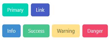
